Abstract
MyFireWatch is a public-access fire information system that shows the location of satellitederived hotspots on a map layer. Originally developed for expert users, MyFireWatch was created with a user-centred design methodology. This paper describes a study of the onscreen viewing behaviour of nonexpert users of MyFireWatch, using eye-tracking technology to observe their use of the system. Non-experts between 20 and 80 years of age were able to use the online system to locate current fires and burnt areas. This validated the design. The study showed that younger users appeared more familiar with interactive map conventions that allowed them to search more quickly than older users. However, older users were able to substitute their prior navigation knowledge for some features. Using aggregated eye-tracking data for different areas of interest on the MyFireWatch interface, maps and fire information functions were viewed by participants the most. Areas on the interface containing menu bars and logos were viewed the least. This paper considers the usability for nonexperts of an interactive map designed to visualise the location of remotely sensed fires.
Introduction
The release of GPS for civilian use in the 1980s, first in car navigation systems and later in mobile devices, has enabled access to interactive map navigation. In a review of user studies on interactive maps, Roth et al. (2017) urged researchers to ‘reenvision the map reader as the map user’ and adopt qualitative and mixed methodologies for studying the phenomenon. Fire maps are complex assemblages of geographic information, including satellitederived data. They often incorporate a standard map layer overlaid with firerelated information and search and navigation tools. Examples of such maps in Australia include North Australia and Rangelands Fire Information,1 Sentinel Hotspots2 and FireWatch.3
Remote sensing and mapping of fires
The FireWatch mapping service commenced in the 1990s and provides nearreal- time fire mapping together with information about lightning strikes, burnt areas, vegetation coverage, aerial photography and topography (Steber et al. 2012). A web-based interface ensures query and distance measurement capabilities. However, the format of this information requires users to understand fire remote-sensing jargon to optimise the use of the service.
The FireWatch online fire map is produced by Landgate, a Western Australia government agency responsible for collecting and communicating spatial information. Fire locations are derived from satellites that can detect fire locations as they pass overhead roughly once every 2-4 hours. Fire locations are detected by determining whether a particular area of the Earth’s surface is hot relative to neighbouring areas. The output from the algorithms used to detect fire locations comprises latitude, longitude, sometimes a confidence level and fire intensity. FireWatch overlays these fire ‘hotspots’ on a base map. Fire locations are usually produced within 45 minutes after a satellite pass.
Redesigning FireWatch for public use
Between 2012 and 2015, a redesign of FireWatch for greater community access was undertaken during a period of intense scrutiny about bushfire response and a developing understanding about shared responsibility for fire safety (McLennan & Handmer 2012). Loss of property and life in bushfires that occurred during the project emphasised the need for timely information and increased public access to information (e.g. Keelty 2011, 2012). Non-expert users were envisaged from an early stage, using a scenario-based design process (Haimes, Jung & Medley 2012). Following prototyping of the redesigned site, side-by-side user testing in a regional community was employed using card sorting of features to refine the design (Haimes 2015). A new site, MyFireWatch, incorporated contemporary design principles and implemented the results of this community-based research in regional Western Australia (Haimes et al. 2013). Since July 2014, MyFireWatch4 has been accessible from internet-enabled devices. Its responsive design allows viewing on tablets and mobile devices (see Figure 1). MyFireWatch usage has grown steadily from around 700 unique users in 2014 to a peak of 20,226 users during the Waroona and Yarloop fires in January 2016. People could access visual information about the fires using MyFireWatch via online news sites and social media.
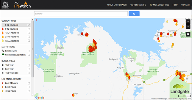
Figure 1: MyFireWatch screenshot of fires overlaid onto a satellite-produced map.
How users ‘see’ MyFireWatch
Design for public websites must necessarily make assumptions about its users. MyFireWatch was redesigned with regional users in mind, however, the open-access site is available to all users. This study investigated the usage and viewing behaviour of non-expert users, particularly those in different age groups, through eye-tracking technology and direct observations. Two questions were considered:
- Can non-expert users of different ages and backgrounds use MyFireWatch to locate fire information?
- What does eye-tracking reveal about how users ‘see’ the MyFireWatch site?
Methodology
The methodology for this project acknowledges that maps are representative models and reflect the social systems in which they are created (Harley 1989). User understanding of fire maps is dependent on individual contexts, including user education and experience. FireWatch was created for expert users who are familiar with the conventions of interactive maps in fire and land management. The redesigned MyFireWatch retained features developed for expert users, but improved the visual representations and functionality. Of particular interest was how non-expert user ‘saw’ a tool originally designed for experts and whether any features were constraining. Use of eye-tracking provided a side-by-side user testing protocol and provided information about onscreen focal points for participants (Çöltekin et al. 2009).
Sample
A purposeful sample of users was recruited based on three criteria: they were computer users, had a current driver’s licence and were new users of MyFireWatch. Four types of users were identified for investigation:
- grey nomads
- rangers
- international tourists
- 20-somethings.
For each user group, recruitment aimed to deliver subjects who shared some attributes of potential users. The sampling was based on personas as developed by Haimes, Jung and Medley (2012).
Grey nomads is a colloquial term used to describe retirees who travel by caravan throughout regional Australia. To represent this type of user, participants were over the age of 60 who were in good health, interested in travel and had a current driver’s licence (although they may not have been ‘grey nomads’ at the time of the study).
For the rangers group, participants were sought with occupations that included an outdoors or spatial component. The final rangers sample included a traffic officer, a security guard, a retired agronomist and a performance artist
As analogues of international tourists, international university students were recruited who were aged under 26 years and had a driver’s licence (nationalities of the final sample were German, Chinese, Singaporean and Polish).
For ‘20-somethings’, participants had a range of occupations.
The study sample collapsed into two broad age groups (see Table 1) and consisted of eight men and eight women. Gender was equally divided across the older and younger age groups.
Table 1: Numbers of participants by study type and age range.
| Type of user (average age) | Older users (age 35-83) | Younger users (age 19-26) |
| Rangers (61) | 4 | - |
| Grey nomads (75) | 4 | - |
| International tourists (26) | - | 4 |
| 20 somethings (21) | - | 4 |
| Total | 8 | 8 |
Procedure
Side-by-side user testing was conducted in an eyetracking laboratory to determine how the types of users interacted with the MyFireWatch site. The test protocols involved participants locating particular features on the site (e.g. finding the location of an actively burning fire in their path of travel). A preliminary interview about their use of technology was followed by a 25-minute eyetracking experiment covering four tasks (see Table 2). On completion, individual sessions were replayed to participants who were encouraged to ask questions.
Table 2: User tasks of MyFireWatch using eye-tracking equipment.
| Order | Task | Description of task |
| 1 | Familiarise | Two unguided minutes for the participant to explore MyFireWatch |
| 2 | Search | Determine if there were active fires within 50km of Broome. |
| 3 | Search | Determine whether the area surrounding Mt Isa had burnt in the last two years. |
| 4 | Plan | Plan the route from Perth to Port Hedland, taking fires into consideration. |
The eye-tracking set-up was a 17-inch LCD screen with a Tobii T-120 eye-tracking monitor. Users were given an information letter and provided their written consent to participate.
After the eye-tracking recording, areas of interest were defined as focal points for analysis and to investigate the use of different features of the site (see Figure 2). Fixation counts (the number of times individuals fixated on particular locations) and fixation duration (the time in seconds of each fixation) were recorded by the Tobii T-120 eye-tracking monitor. The time taken for each task, in minutes, was scored manually after replaying the video and screen captures of each session. These were used to discern differences in usage between participants and groups.
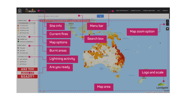
Figure 2: Areas of interest overlaid on the MyFireWatch interface.
Results and discussion
Familiarisation
During the preliminary interview, users were questioned about their use of technology. All but three participants (one ranger and two grey nomads) had used a desktop computer and smartphone or tablet to access the internet. Only two participants in the older age group used a smartphone to access the internet and had used a smartphone-based navigation system (e.g. Google Maps). All participants in the younger aged group had accessed the internet via a smartphone and all but one used a navigation system. No participants had used MyFireWatch previously. The familiarisation task provided an opportunity to observe and record how participants viewed MyFireWatch and how they experienced it for the first time (see Figure 3).
Note: Numbers represent eye fixations in sequence. The dot size represents the duration of gaze at a particular location.
Figure 3: Gaze plot of a grey nomad during the first two minutes of familiarisation with MyFireWatch.
Eye-tracking data revealed that most participants gazed at the map area and side menu bar of the site preferentially. This finding is consistent with Ooms, De Maeyer and Fack (2014), who found that eye movements of both expert and non-expert viewers of screen-based maps were similar in focusing on the map area. In the present study, areas of interest were assigned after eyetracking recording to measure the usage of components of the map interface. Combining data for all participants, 66 per cent of fixation time was spent on the map area (see Figure 2 for defined areas). Current fires, satellite and greenness, burnt areas and lightning activity were the major areas of interest viewed (see Figure 4).
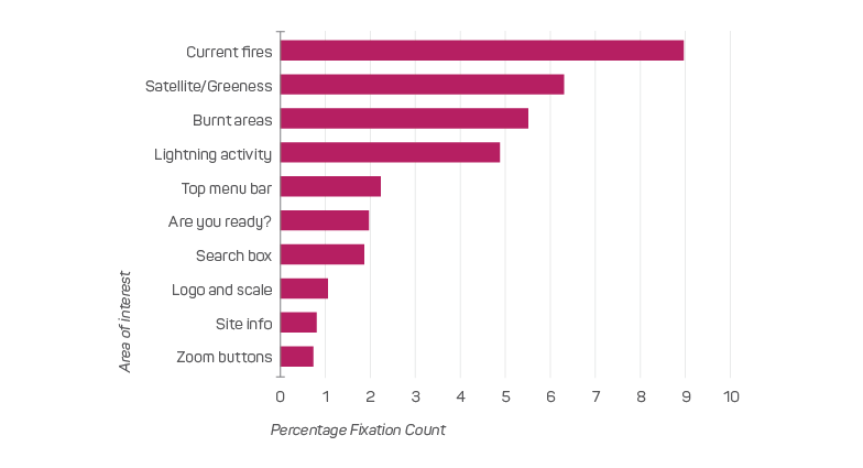
Figure 4: The percentage fixation counts for areas of interest (excluding map area) for how participants ‘saw’ the information during the first two minutes of familiarisation with MyFireWatch.
The features included in MyFireWatch, based on user testing during the redesign (Haimes et al. 2013), were confirmed by this study as attractive for non-expert users. However, a very low number of views resulted for zoom buttons, site information, the search box, the top menu bar and the logo and scale. One explanation for these results is that, because the map was easy for users to understand, they were less likely to obtain full value from the site due to lack of familiarity with the possibilities of interactive map use. Observation of the screen capture data from the eye-tracking experiment indicated that older users were less likely to use double clicks or the scroll wheel for zooming in and out. Older users were also less likely to change the map layers during the familiarisation task. These results may also be explained by older users fixating more on the centre of the screen at the expense of peripheral regions, which has been previously observed by Bergstrom, Olmsted- Hawala and Jens (2013).
The eye-tracking software produced opacity plots that average the areas of the interface ‘seen’ by users (see Figure 5). While it is perhaps obvious that the map is the most important feature, opacity plots are worth considering as much of the interface design efforts focus on providing easy-to-use features and tools. Taken together, the areas of interest analysis and opacity plots show that users do not necessarily attend to all interface elements, such as menus. We assumed that at least the older group would have used printed road maps in the past. For such users, additional map features behind menus may not be ‘seen’ regardless of the additional functionality they offer.
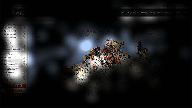
Figure 5: Gaze opacity plot showing areas of the interface ‘seen’ by a grey nomad participant in the first two minutes of familiarisation with MyFireWatch.
Search tasks
Locating the township of Broome was chosen for the first search task as there were active fires in the region at the time of the study period. All but one participant understood the fire icons without explanation. Most participants were able to locate the town of Broome and determine whether fires were present. Participants used a variety of methods to achieve this. Five participants were not able to complete the task. The younger users were generally faster, using features such as the search box (see Figure 6). They were also more likely to use the mouse to pan and zoom, while older users were more likely to use the zoom buttons. Five younger participants verses only two older participants used the search box. Participants from both groups were disoriented when they searched for a location via the search box and the map zoomed in to the centre of the town. Younger users were less likely to note the scale bar on the map in relation to the instruction.

Figure 6: Median duration time of task in minutes for participants who completed search tasks using MyFireWatch.
For the second search task, determining burnt areas, the township of Mount Isa, Queensland, was chosen, as it was less familiar to residents of Western Australia and international students. As expected, most participants had to use the search tool to locate Mount Isa, including all but one of the younger participants. They then had to turn on the correct display for burnt areas using the side menu bar. All but one participant indicated that the task was complete when black shaded areas (i.e. burnt areas) appeared on-screen. This confirmed that the visual elements were understandable.
Of these two search tasks, users struggled with zooming to the scale required to detect fires and burnt areas, although MyFireWatch has multiple zoom options (buttons, double-click, scroll and rectangle). Manson et al. (2012) cited studies documenting expert and novice users of interactive maps experiencing difficulty with zoom and pan functions. Observation during this eye-tracking experiment indicated that unfamiliarity with zoom and pan functions lead to longer task completion times. The older group took longer to complete the search tasks than the younger group (Figure 6). There were no significant differences within the two age groups.
Planning task
During the study, there were several fires on multiple routes that led to Port Hedland, Western Australia. This task was designed to evaluate whether participants could integrate fire information while planning a driving route. It is noted that MyFireWatch is not an emergency notification system and the planning task was not intended to replicate choices made in a fire emergency.
In the preliminary interview, participants were asked to give examples of how they had previously used maps on smartphones. Younger participants provided a range of examples such as ‘When travelling on buses—to confirm route and where to get off’ and ‘Finding the location of a particular beach’. Only three of the eight older participants had used maps on smartphones in this way.
One of the grey nomad group was able to complete the planning task. Three of the ranger group who completed the task did so in less time than the younger participants. This provides tentative support for the contention that they had greater spatial ability (see Table 3).
Table 3: Use of MyFireWatch features and median time to plan a route to a specified location taking fires into consideration.
| Used search box (%) n=4 |
Zoomed out (%) n=4 |
Noted fires (%) n=4 |
Median minutes to complete (n) |
|
| Grey nomads | 25 | 25 | 50 | 1:59 (1) |
| Rangers | 50 | 75 | 25 | 1:01 (3) |
| International tourists | 75 | 100 | 0 | 2:12 (3) |
| 20-somethings | 100 | 100 | 25 | 3:23 (3) |
Observation during the task revealed that unfamiliarity with moving the map interface was the primary barrier for older group users who tended to pan as though they were ‘driving’ across the map. However, they gave more verbal clues that indicated they were actively comparing routes than did younger participants. While younger participants took longer to complete the task, they were more likely to use the search box and zoom. They were less likely to integrate tasks or verbally note the current fires. Several users expected navigation features like Google Maps by typing ‘Perth to Port Hedland’ in the search box. Younger users spent more time looking in the region of Port Hedland (Figure 7).
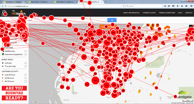
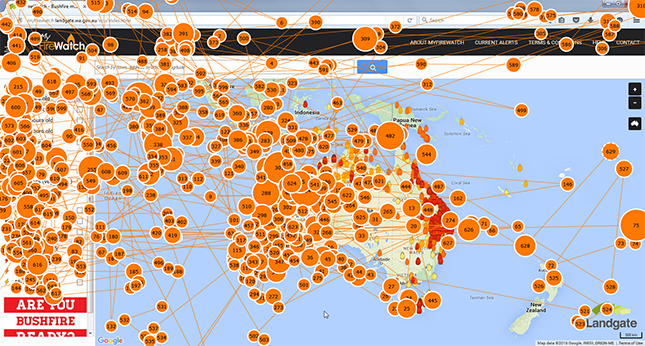
Figure 7: Gaze plot of an international tourist user considering fires during route planning using MyFireWatch.
Current alerts provided by state fire and emergency services are provided in a drop-down menu, which is also activated when a user clicks on an individual hotspot. The pop-up link to the alert page also provides the time of the last satellite pass. Across the experiment, only three users examined the drop-down alert page accessible from the top menu. Eight users activated the pop-up hotspot alert box.
Conclusion
The users of interactive maps effectively co-create the interface with the designer because they are able to use the site functions to change the display of information. The way that different users respond to the functionality of the site and the information displayed after their interaction with it, depends on their prior knowledge of maps and screen-based technology. In this study, users aged between 20 and 80 years could use the MyFireWatch site. Older users were well educated, but most of their working lives predate the internet. Hence, older group participants sometimes substituted their geographical knowledge of Australia to use the interface more efficiently. This can be viewed as ‘active’ engagement as they use the site to suit their needs and abilities. Increasing lifespans and use of internet-enabled devices means that the needs of older people must be considered in the development of map applications.
Striking the balance between providing public access to fire information and avoiding the risk of misunderstanding is perceived to be difficult. However, the use of interactive maps for other purposes means that non-experts are increasingly seeking fire information outside an emergency context.
The current study is limited by the small sample size, which was dictated by the use of the eye-tracking technology. However, visualisation of eye movements showed that patterns primarily reflected the map area and key features. An online fire map like MyFireWatch is a complex mix of information from multiple sources. This study confirmed the usability of map features chosen for the user-centred redesign of MyFireWatch for nonexpert users. The study also confirmed that interactive map functions, such as pan and zoom, influence the time taken by non-expert users to search for and locate information.
Future development could investigate explicit labelling of navigation tools that may improve effective use by non-experts. Restricting the level of zoom could be considered to reduce any disorientation experienced by users after searching for locations and to avoid any misunderstanding about the accuracy of hotspot representation. MyFireWatch can be used as an additional source of information by non-expert users to improve their spatial understanding of fire events and to plan travel. It may also have a role to play in education about the frequency and seasonality of fires in Australia.
Footnotes
- North Australia and Rangelands Fire Information. At: www.firenorth.org.au
- Sentinel Hotspots. At: https://sentinel.ga.gov.au
- FireWatch. At: http://srss.landgate.wa.gov.au/fire.php
- MyFireWatch. At: myfirewatch.landgate.wa.gov.au